Attention to detail ~ Realism!
In my last blog Looking Back and Looking Down, I wrote about aerial perspective paintings I painted for MBNA as their resident artist. All of the detail I put into the office buildings, reminded me of one of MBNA’s creeds, “Attention to detail”. There was a “from the top down” discipline that created a winning attitude among the people who worked there. You could feel it when you walked into one of the many worldwide office buildings. People were polite and professional. The attention to detail was carried over into the working environment from the artwork on the walls to the exteriors of the buildings themselves. My job was to paint those exteriors with little brushes, not big brushes! ☺
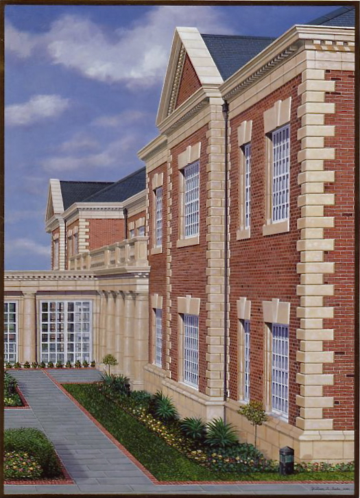
On one occasion back in 2001, my assignment was to paint the MBNA office building in Chester, England. I flew over to photograph the facility from all angles, came home and painted this painting for the cover of the stockholders’ Quarterly Report.
MBNA Chester England Office, painting by William R. Beebe
It has become one of my favorites of the many office building paintings I painted over my 10 years with MBNA. The Chester office building epitomizes the “attention to detail” philosophy, including many architectural elements like cornerstones, dental moldings, pediments, sills, pillars, slate sidewalks lined with bricks, etc…
The many artistic challenges included a detailed drafting of the building in pencil on a hardwood board. Many hours were put into the under-drawing to make sure the perspective was correct.
Painting in every little brick and dental molding required the littlest of brushes. Through the glassed corridor, multiple windowpanes offset each other adding perspective.
Subtle shading on the limestone indicates the direction of sunlight, creating various delicate differences in tones. Little architectural elements like the beveled edges on the cornerstones were not to be overlooked.
Not all of my paintings included this much detail, but when I first saw this building I knew I had to include all of the architectural elements. They were more than just decorative. They were meant to create a striking first impression when visiting the bank.
In this case, I believed crisp realism was necessary to not only capture all of the architectural elements, but to convey the uncompromising attention to detail mentality that permeated throughout the company and helped create MBNA’s winning legacy.
Thank you as always for reading my journal and your interest in my art. Please check back soon to see what’s on my easel! Thanks.
“One of the joys of being an artist is having the freedom to follow my passion...”
What's next?
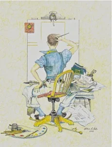
Drawing by William R. Beebe


