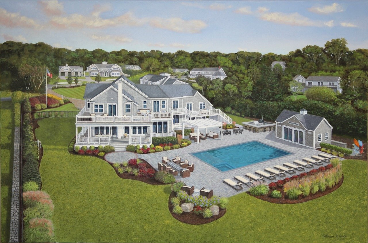
The Third Dimension ~ Working from a drone image!
Cape Cod Compound by William R. Beebe, 24 x 36, Oil on canvas, commissioned
When I was commissioned to paint an aerial view of a family compound on Cape Cod I was excited to take on the challenging project. Getting started, however, I must admit I was slightly overwhelmed. Fortunately, I spent roughy ten years painting MBNA office buildings from every angle, including aerial views.
How does one create the appearance of a third dimension on a two dimensional surface? If you look up three dimensional space one can easily get overwhelmed by the mathematics and physics involved in defining space, and by the talk of vanishing points, volume, edges, face, vertex, length, width, and depth! Mix in viewing 3D objects from space and things get complicated!
The first step was to correct the slight distortion that the drone image created. Even though it was a high resolution beautiful image to work from the depth to all of the buildings were skewed like what a wide angle lens sometimes creates. On my computer I used a software program to skew the buildings back to normal, causing the third dimension (height or depth) to become perfectly vertical.
Now I had a sound image to work from. Next came the drafting onto the large canvas. Many of the vanishing points would have been way off the canvas, so most of them had to be visualized. I used an architectural elbow drafting tool to create the many vertical lines and to transfer many of the angles from my working image to the canvas.
I always start with the largest, most important part of the drawing, which in this case was the main house. Once the house took shape I used that as a base from which to make all other measurements. The “appearance of depth” was evolving!
They say that “every point in space can be described by a linear combination of three vectors”. One of my favorite lines in the movie Airplane is, “What’s your vector Victor?” :)
Shadows created by sunlight hitting objects also help create the illusion of space. Take for instance the shadow on the left side of the main home. The shaded grass helps the sunlit house rise from the ground.
The distant homes shrink in size as they recess into the woods. Having a significant disparity in size of structures also helps create a sense of distance or depth. I had to pay careful attention to how objects in the painting relate to each other in terms of size.
I have a hard time leaving out fine details when painting beautiful architecture. After all it is the finishing details that people put into their homes that creates the charm and makes a house a home. So I spent quite a bit of time using the tiniest of brushes.
I loved the challenge of this commission. Even though my progress was slow, each day it was enjoyable to stand back to check my vectors. :)
Now when I stand back I get that feeling like I am hovering above Cape Cod Bay in maybe a hot air balloon or on a hang glider on a beautiful sunny day admiring a waterfront paradise.
Thank you for reading my journal and for your interest in my art. I hope you like the painting. I’m thinking a few Lowcountry marsh scenes might be next but we’ll see. Stay tuned…
“One of the joys of being an artist is having the freedom to follow my passion….”
What’s next?
Drawing by William R. Beebe


